1/8
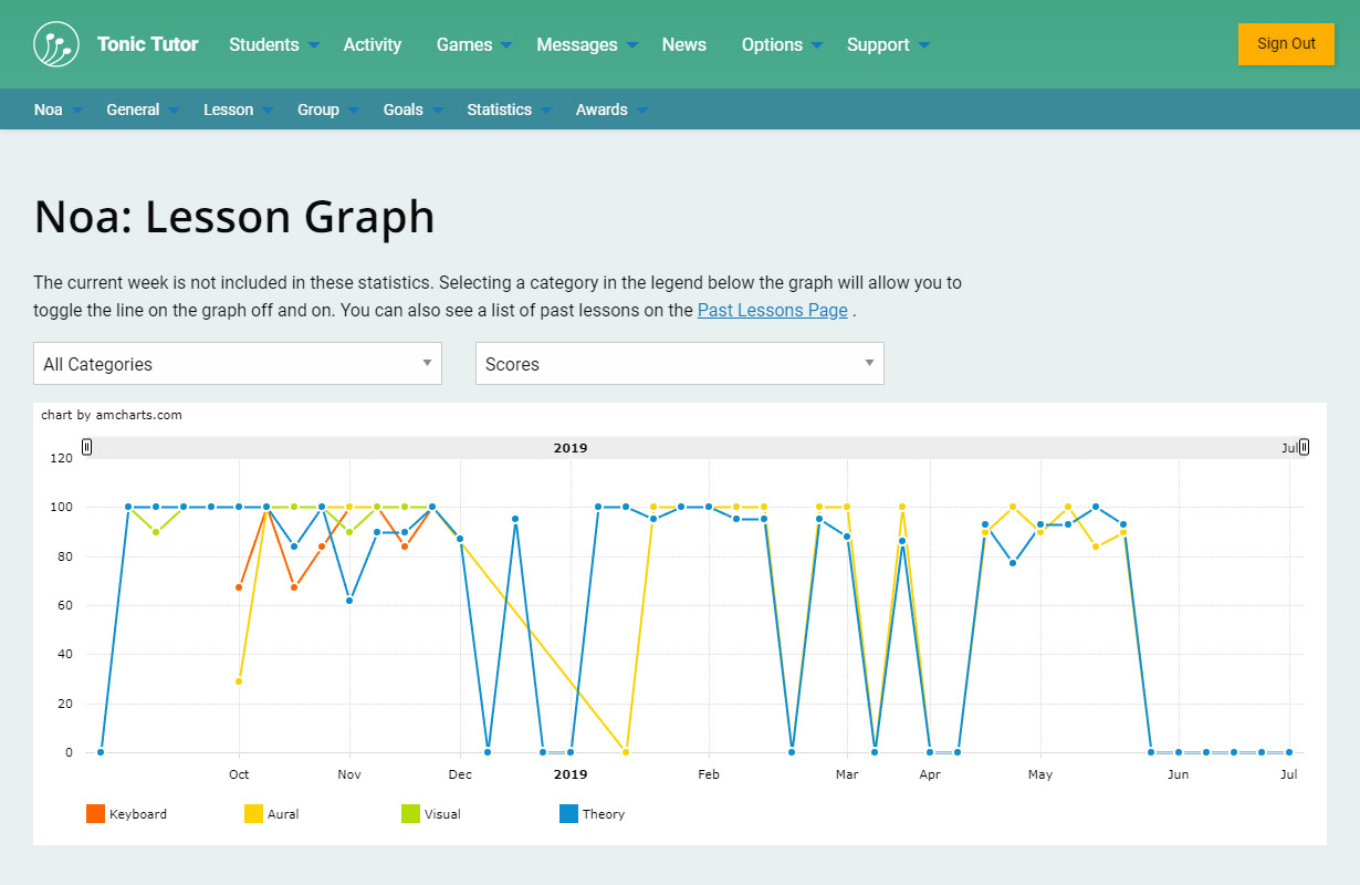
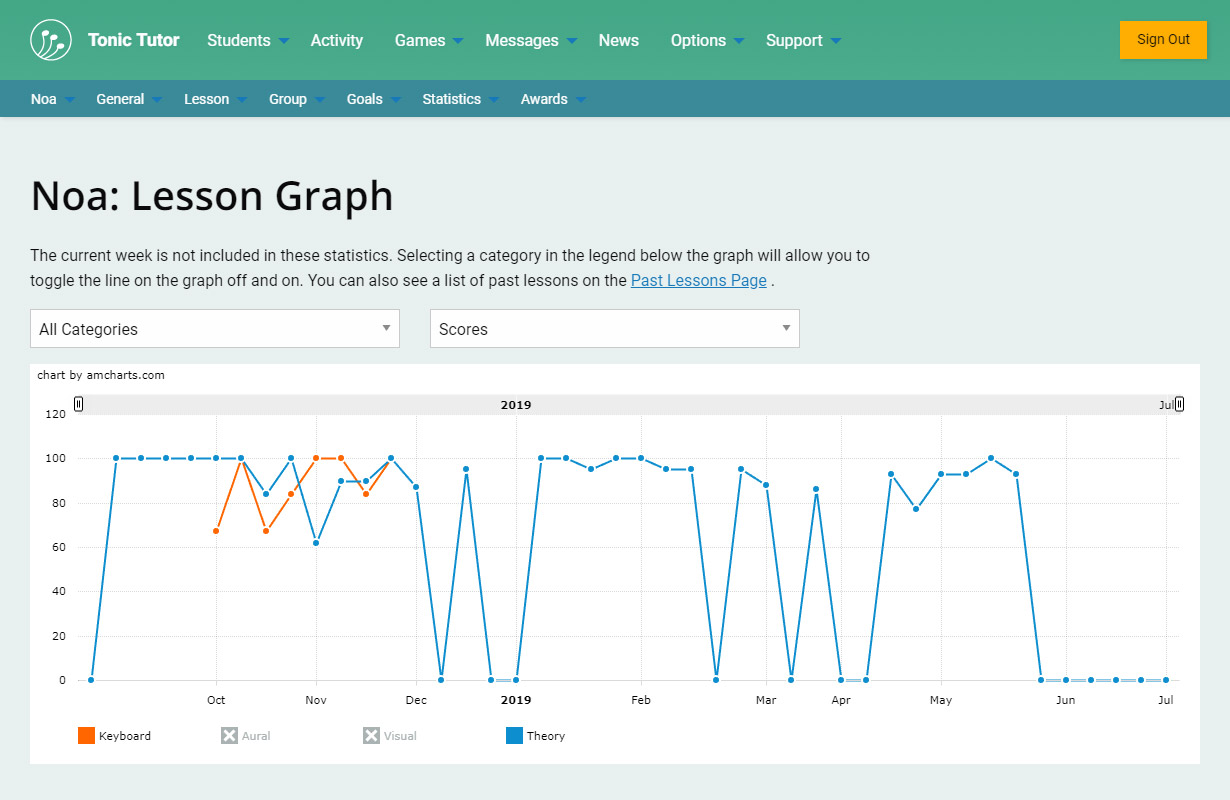
Lesson Graphs is a powerful tool that you can use to analyze a student's progress over a period of time. By default, the scores for a student's current lesson year are displayed on the graph. Each line on the graph uses a unique colour which matches the colour of the category name displayed in the legend below the graph. In the screenshot, Theory is blue on the graph and Keyboard is orange.
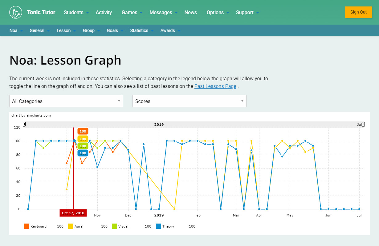
If you hover your cursor over the graph (or tap on it if you're on a touch device), you'll see the scores and the start date of the lesson appear.
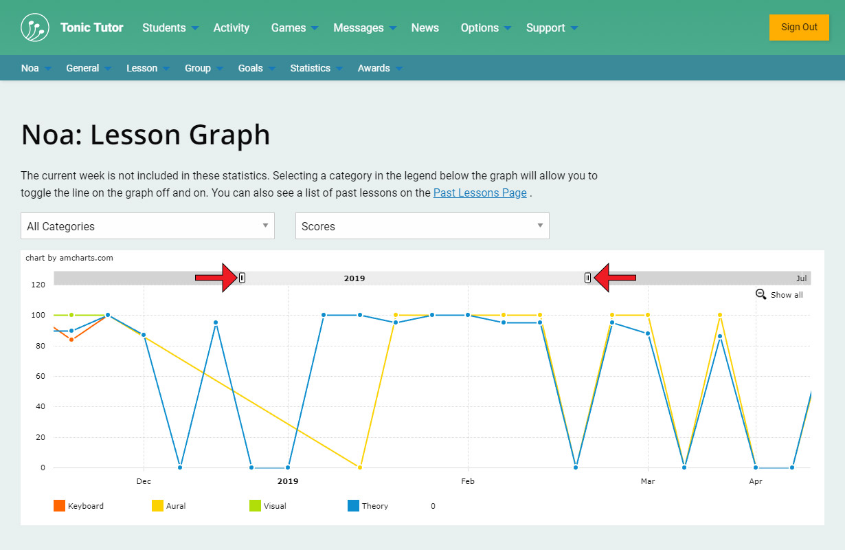
If the year has been going on for a while, there might be so much information displayed that it's difficult to parse. You can use the two handles above the graph to limit the start and end date that the graph is displaying. Selecting the Show All magnifying glass in the top right corner will reset the graph to the default timeline.
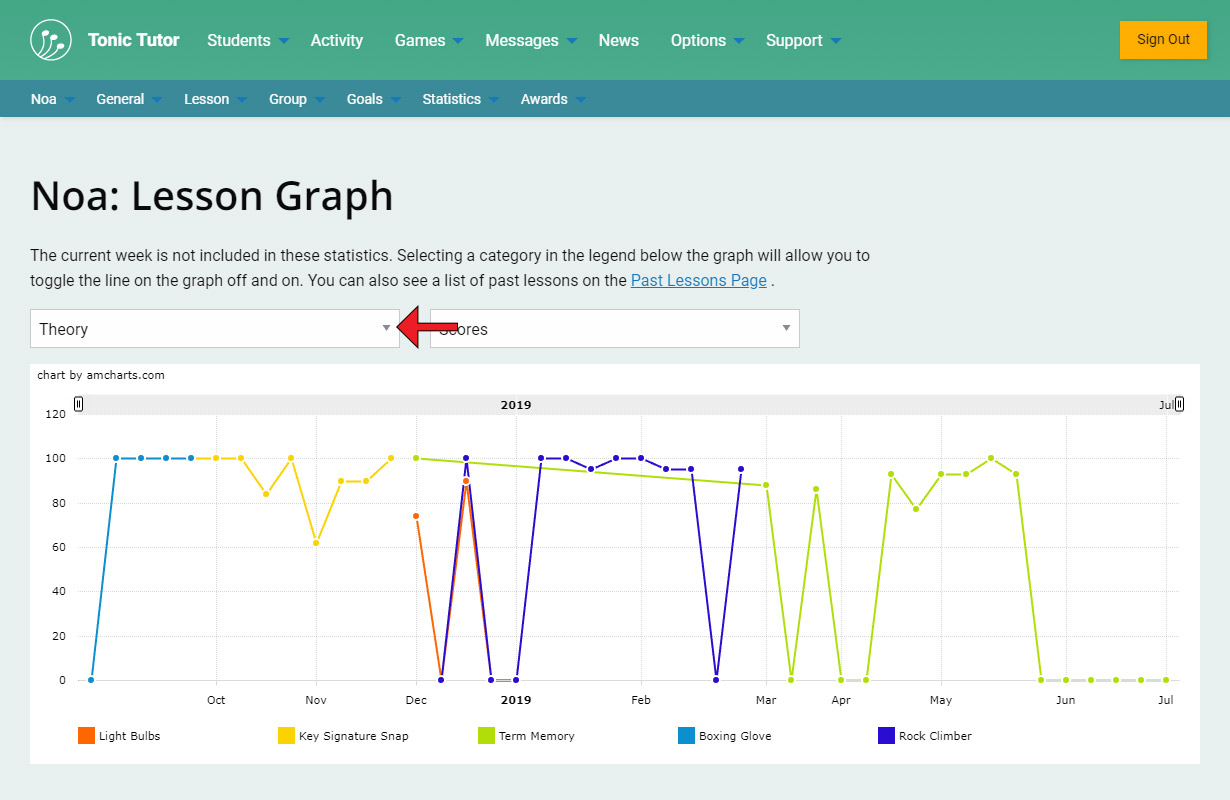
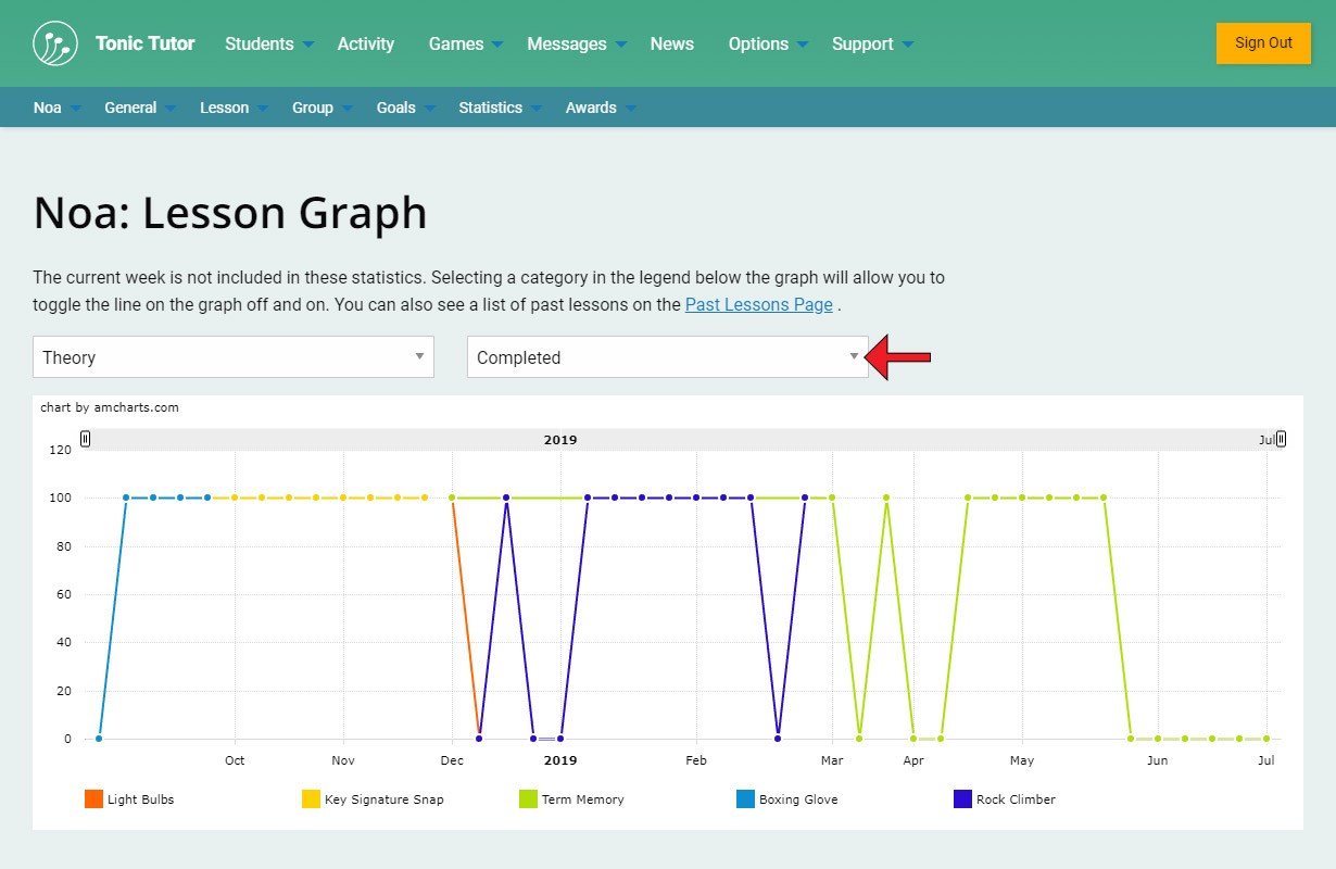
There are drop-down menus that you can use to select the type of information displayed on the graph. By default, all of the categories are displayed, but you can use the first drop-down menu to select a single category or subcategory. If I select Theory, you can see how the graph changes: I only see information from lessons related to the games that are part of that category.
The next drop-down menu allows you to display scores or the amount of the lesson that was completed. By default the graph shows scores.
You can toggle each individual item on the graph on or off using the legend. In the screenshot you can see that I've toggled the Aural and Visual categories off (both have a grey X next to them to indicate that they're no longer being displayed). On the graph, only the two active categories are being displayed.
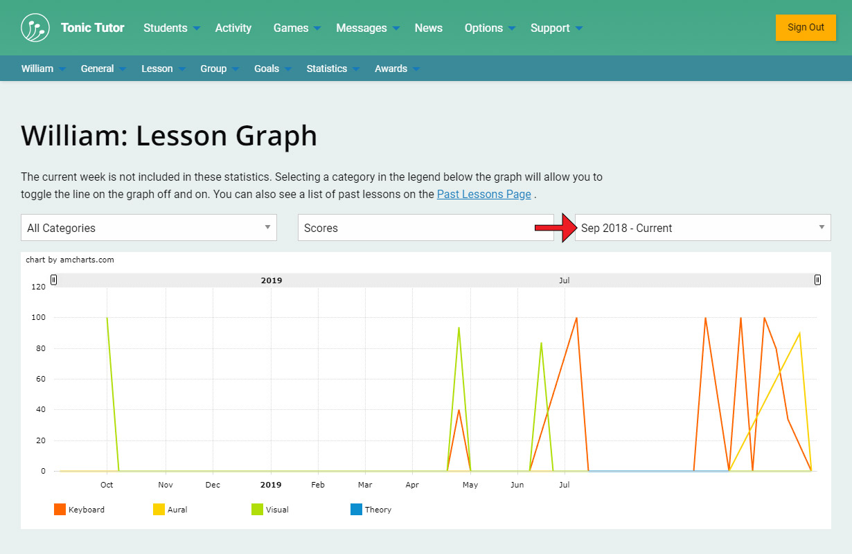
If a student has been active on Tonic Tutor for more than a year, a third drop-down menu will be displayed where you can select previous years. By default the current year is selected. If you don't see a third drop-down menu, that means the student doesn't have multiple years. You can find out more about how lesson years work in the What are Lesson Years? tutorial.
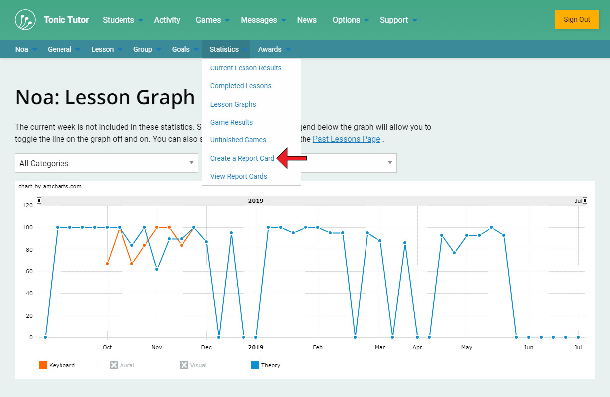
Now we know how to see a whole bunch of data at a glance, what if we want to communicate to a student how well they're doing? That's where Report Cards come in!
View the next tutorial: Report Cards